1. In what ways does your product use, develop, or challenge forms and conventions of real media products?
My magazine followed many conventions, for one the genre isn't an obscure genre which is quite big around the world and is MAINSTREAM because it includes artists like Tinchy Stryder and 50 Cent. My magazine in my view is a watered down version of a magazine called XXL {view link}-
http://nahright.com/news/wp-content/uploads/2008/08/xxl-october-08.jpg
If you view this link you will see the similarity in text and picture usage but one thing my magazine doesn't follow like this magazine is over usage of swearing on the front cover{view link}-
http://dajaz1.com/uploaded_images/xxl-nov08-760582.jpg
The link doesn't show how bad it can be but in my view I'm going against the stereotype of Hip Hop magazines and as my audience goes from about 13-30 years old, so I didn't want it too childish but tried to make it with a bit of an adult feel for reference to what I'm talking about view my contents-
http://hemalc.blogspot.com/2010/03/contents.html.
In my contents I haven't really followed the same path as my cover and double page spread which are quite the same but the cover is a bit less open spaced as my double page spread title page.
2. How does your product represent particular social groups?
My magazine represents the social group-hip hop fans and artists quite well, unlike some hip hop magazines on sale at the moment; my magazine shows a good representation of people who are part of hip hop and around the music genre. In my view I think some magazines that use the genre go away from what’s important which is the music , in my magazine most the articles available are about music with features like charts , interviews and only one article about fashion unlike some magazines that take some news into the factor , one incident is when Obama came into power the magazine VIBE used Obama in the front cover to represent black power but that's going away from market of white customers as Hip Hop has grown around the world.
3. Who would be the audience for your product?
The audience for my product is between the ages 13 and 30. My magazine is mainly for people who are young but also for people coming into adulthood. I don't try and make my magazine fully for the younger audience but more of a serious magazine with a younger twist so both ends of my audience enjoy the magazine. But some older people (25-30) might find the magazine not as serious as magazines like XXL and VIBE but in my view my audience group would both enjoy the magazine.-
My magazine followed many conventions, for one the genre isn't an obscure genre which is quite big around the world and is MAINSTREAM because it includes artists like Tinchy Stryder and 50 Cent. My magazine in my view is a watered down version of a magazine called XXL {view link}-
http://nahright.com/news/wp-content/uploads/2008/08/xxl-october-08.jpg
If you view this link you will see the similarity in text and picture usage but one thing my magazine doesn't follow like this magazine is over usage of swearing on the front cover{view link}-
http://dajaz1.com/uploaded_images/xxl-nov08-760582.jpg
The link doesn't show how bad it can be but in my view I'm going against the stereotype of Hip Hop magazines and as my audience goes from about 13-30 years old, so I didn't want it too childish but tried to make it with a bit of an adult feel for reference to what I'm talking about view my contents-
http://hemalc.blogspot.com/2010/03/contents.html.
In my contents I haven't really followed the same path as my cover and double page spread which are quite the same but the cover is a bit less open spaced as my double page spread title page.
2. How does your product represent particular social groups?
My magazine represents the social group-hip hop fans and artists quite well, unlike some hip hop magazines on sale at the moment; my magazine shows a good representation of people who are part of hip hop and around the music genre. In my view I think some magazines that use the genre go away from what’s important which is the music , in my magazine most the articles available are about music with features like charts , interviews and only one article about fashion unlike some magazines that take some news into the factor , one incident is when Obama came into power the magazine VIBE used Obama in the front cover to represent black power but that's going away from market of white customers as Hip Hop has grown around the world.
3. Who would be the audience for your product?
The audience for my product is between the ages 13 and 30. My magazine is mainly for people who are young but also for people coming into adulthood. I don't try and make my magazine fully for the younger audience but more of a serious magazine with a younger twist so both ends of my audience enjoy the magazine. But some older people (25-30) might find the magazine not as serious as magazines like XXL and VIBE but in my view my audience group would both enjoy the magazine.-
YOUNGER-Tinchy Stryder interview, new act interview, 50 cent interview, Hip Hop fashion tips and Sean Pauls new album
OLDER-100 top hip hop tracks, Top 100 albums, Hip Hop Gigs, Hip Hop Tech and The Last Word page.
My magazine is quite open to different age groups as it hasn't got any swearing and has many mainstream artist in stories so a supermarket like Asda could sell it because the magazine could be read from a big age group (13-30) but a stores like footlocker could also distribute it because it has sections on hip hop fashion and also has a mainstream music artists which could advertise the magazine. my magazine would also be available online like on Magatopia.com which allows users to read a subscribed magazine and another website that would be able to distribute the magazine is the website amazon.com which allows customers to buy magazines online/ buy a subscription and they will send you the magazine .Q magazine sells 200,000 units per month, this figure is something I would want my magazine to replicate. Also in my view the magazine going monthly allow more information to go in the magazine and allow it to be refined more and have a better finish. While American magazine XXL sold 28100 units which aren’t good for a Hip hop magazine.
4. How did you attract/address your audience?
My magazine is mainly centred for America and the UK .I tried to make my magazine so it caters for both groups with the American Rap and British Rap. So both parts of my audience again don't feel like they have been left out but also connected to that I have shown I want both types of artist to be in the magazine-
AMERICA-50 CENT, Kanye West, Sean Paul
UK-Tinchy Stryder, Micheal Wooton (my Created artist)
As you can see my magazine is set more for a mainstream market as I see mainstream music more important as a lot of artists are becoming more mainstream-chipmunk and Tinchy Stryder. My magazine is mainly for boys, not in a way that it shows loads of women but because the fact that I don't mention many women hip hop artists.
To attract my audience(male, 13-30, UK and America) I did many things , one was for my UK market , the fact that I used a British artist on the cover but also to attract my audience in America I had Kanye west article title on the cover and in the contents I included 50 cent , Sean Paul and Kanye west but because of that I included sections on British Rap and Tinchy Stryder and Micheal Wooton.I made my magazine very dark and not too colourful , as more colour would aim the magazine to more of a audience that's younger. I also used different colour/contrast options because I wanted to give my images a darker feeling again so the age range doesn't change. Once again I used only male hip hop artist to connect it more with the boys, unlike the way some hip hop magazines portray women in a bad light{view links}-
http://site.dropcents.com/blog/wp-content/uploads/2009/07/vibe_keyshia_cole_.pnghttp://blog.pentagram.com/VIBE_embed_5.jpghttp://www.pardonmeduke.com/flicks/misc/June-Vibe.jpghttp://somanymp3s.com/wp-content/uploads/2009/07/ciara-vibe-magazine.jpghttp://farm4.static.flickr.com/3128/2510680650_ddf03d23a9.jpghttp://francisphan.com/news/hello/1997576/1024/OmegaRed_Source_OFS-2005.09.25-10.40.34.jpg https://blogger.googleusercontent.com/img/b/R29vZ2xl/AVvXsEgn_PF_x4KFsnIlFcuzANPzOiojNI3DUAAF7DmMLiBzeqT1zCxM1Ygp-NsaP-hv0SHZj-uNDqigc6g9jMkTbjBexj_jnoQY-Yrtq8y8tXylAAMTNxITDbM7LzZ0CdNLIloiYgA_rJjXR75v/s400/source.jpg http://www.blogdownchicagobears.com/wp-content/uploads/2008/09/source-magazine.jpg
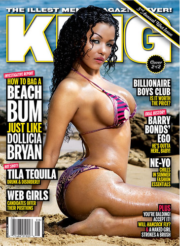
This shows women in a bad light unlike when they have men on the cover of the magazine {view links}-
http://esmesmedia.files.wordpress.com/2009/02/chris-brown-vibe-magazine.jpghttp://www.reelmovienews.com/wp-content/uploads/2008/02/vibe-righteous-kill.jpghttp://www.prefixmag.com/site_media/uploads/images/posts/e/eminem-xxl.jpghttp://nahright.com/news/wp-content/uploads/2008/08/xxl-october-08.jpghttp://wes.liberatedmatter.com/sitdownstandup/images/cover2freshmen.jpghttps://blogger.googleusercontent.com/img/b/R29vZ2xl/AVvXsEgFO0QaApmpdSALCWyZcv7en8eT9C5qqEjB7uXBHAUWym9NKYCZx_UtXyTbtVAH_sMMPRQ-Y0nsiOfKqohSYtw0b2P_b6GDbRVDrWsmYXXnZCo-ET0jnv5oQCYQK8CJgfDU2QUeGUKTF69Z/s1600/xxl-111cover_dipset.jpghttp://dajaz1.com/uploaded_images/xxl-nov08-760582.jpg
5. What have you learnt about technologies from the process of constructing this product?
When making my magazine I used 3 programs mainly- Photoshop, Fireworks and Word (I also used power point for planning)
PHOTOSHOP-I used Photoshop when I wanted to do detailed editing because there are more options for editing in Photoshop because fireworks is much easier but Photoshop allows me to edit with better versions of fireworks tools.
FIREWORKS-I made my magazine on this program because I used it before in my preliminary task and I felt it was much easier to use for putting all the information on my main magazine it also helped me when I wanted to put text on my magazine , so it allowed me to put different effects on my magazine.
WORD-I used word mainly for spell checking information I put into the magazine (contents, double page spread and front cover), so I basically used it to double check all the information I needed.
When making my magazine I came across a few problems when trying to make it look better and more professional. The biggest problem I had were the images I used, due to the fact I didn't have a top quality camera some of my images were affected by lighting, blur and placement. So when it came to editing I came across some problems but by using different tools on Photoshop and fireworks called blur, burn and dodge tool which helped me when editing the photos and different effects I used when putting the images on the magazine pages one of the most useful effect was the Gaussian blur which helped capture the feel of the magazine and made images and some text look more refined and suitable for my magazine. To prevent this happening gain I know I have to plan my photo shoots more and try to use white backgrounds/planned backgrounds to make my images a higher quality.
6. Ownership of your Magazine
Bauer Media Group is the owner i think would suit my magazine because of its ownership of other magazines such as Q and Kerrang.Which shows it knows about the industry in which both their magazines have music channels and have a massive following from music fans. Bauer group is based in Germany and was founded in 1875.Worldwide circulation of Bauer Media Group's magazine titles sold amount to around 38 million magazines a week which shows the group has an understanding on the industry.




i)
